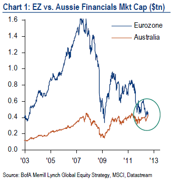
Every once in a while you see a statistic that just defies logic. The one that really jumped out at me (that I vividly recall) was during the financial crisis when I read on a Bloomberg Chart of the Day that the US banking sector had fallen as much as the Nasdaq had during the tech bust. Although it made complete sense at the time, you just read a statistic like that and say “is this not overdone”? The day that was posted just happened (by chance) to be the bottom of the market in 2009.
Given the fact that the Euro crisis is never ending (thanks to a lack of political compromise) it’s unlikely that the timing on this one will be anything remotely similar, but this statistic just jumped out at me as a sign of incredible skew in a large market. It’s food for thought and as always, certainly not an investment recommendation, but a very nice 30,000 foot view of the collapse in European equities during the last few years. The European financial sector is now smaller than Australia’s! Now that has to make you go “hmmmm”. (via Bank of America):
- The US is by far the largest equity market ($12.8trn), Financials the largest global sector ($5.2trn) & US Tech the largest country-sector (at $2.5trn it now exceeds the entire Eurozone equity market capitalization).
- The financial sectors market caps show that the BRIC banking sector is larger than Japan’s, and Australian banks are larger than Eurozone banks. (emphasis added).
Source: Bank of America Merrill Lynch
Mr. Roche is the Founder and Chief Investment Officer of Discipline Funds.Discipline Funds is a low fee financial advisory firm with a focus on helping people be more disciplined with their finances.
He is also the author of Pragmatic Capitalism: What Every Investor Needs to Understand About Money and Finance, Understanding the Modern Monetary System and Understanding Modern Portfolio Construction.


Comments are closed.