
The team at Business Insider reached out to a lot of great analysts (and then clearly ran out of good sources and reached out to me) for their take on the 70 best charts of 2012. And the list they came up with is excellent.
I have a small blurb in there on a chart and theme that will sound all too familiar:
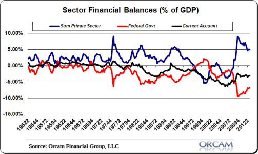
No understanding has been more important in the last 5 years than the understanding of the sectoral financial balances. Economists and traders who understood this important economic lesson that originated with Nicholas Kaldor and was made famous by Wynne Godley had an enormous advantage over the rest of the world in terms of understanding the future of the economy and the markets. When combined with the understanding of the Balance Sheet Recession it became obvious that the private sector was going to be too weak to sustain itself due to the destruction to private balance sheets as a result of the credit bubble. But understanding the SFB meant you understood that the government’s deficit would drive income to the private sector when it was sorely needed. And this meant corporate profits would increase, markets would remain bolstered and the crisis would slowly become a healing process. 2012 was another clear example of this as austerity plagued many European nations and large budget deficits in the USA continued to steer the economy and markets higher.
(Chart via Orcam Investment Research)
Mr. Roche is the Founder and Chief Investment Officer of Discipline Funds.Discipline Funds is a low fee financial advisory firm with a focus on helping people be more disciplined with their finances.
He is also the author of Pragmatic Capitalism: What Every Investor Needs to Understand About Money and Finance, Understanding the Modern Monetary System and Understanding Modern Portfolio Construction.
Comments are closed.