
What a wild year it’s been. You could say that the pandemic was like an entire market cycle all rolled into one year. A boom, a bust and a boom. [ … ]
Category: Chart Of The Day
(Just Charts)

When “Bonds” Aren’t Bonds
In finance and economics we tend to use oversimplified terms like “money” and “bonds” when the reality is that it’s important to be more nuanced in understanding these terms. That’s [ … ]

2008 Has Already Happened in the Energy Sector
We’re approaching a level of truly horrific returns in the energy space as the price of oil continues to crumble in the early days of 2016. There are quite a [ … ]
Three Charts I Think I’m Thinking About
Here are three charts I think I am thinking about:
Conflicting Value Indicators Lead to Confusion over Clarity
I’m not a particularly big fan of relying on traditional “value” metrics. It’s not just my mistrust of factor investing. It’s that I just don’t think anyone really knows what [ … ]
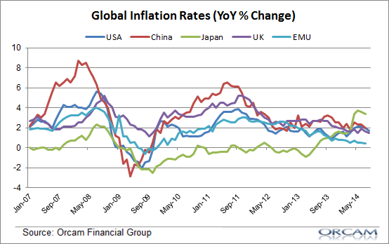
Global Inflation Continues to Fall
This strange new world of disinflation continues. Yesterday’s CPI reading in the USA came in at 1.7% which was down from 2%. Core inflation (minus food and energy) was also [ … ]
High Debt and Low Incomes = Low Housing Demand
Here’s an interesting piece of research from the NY Fed that explains why the demand for housing remains relatively low – potential buyers just have too much debt and not [ … ]
The Long View on German Bond Yields
Here’s some perspective for you on the state of the European economy. German bond yields are at unprecedented nominal levels (via John Mauldin): While it should surprise no one, German [ … ]
The “Secular Stagnation” Theory is Massively Overblown
The bears on global growth have blown the “secular stagnation” theory out of proportion.