
Home prices continued to accelerate at a double digit pace in April according to CoreLogic. The latest reading came in at 10.5% year over year which is the fifteenth consecutive double digit reading.
Category: Chart Of The Day
(Just Charts)

SocGen: Beware the Global Macro Slowdown
Just passing along this data point from the Cross Asset Research team. They cite the CitiGroup Economic Surprise Index for several regions to reinforce their case for a global macro slowdown:
Why and How the ECB Might Implement QE
Important chart here from Michael McDonough at Bloomberg. It shows the spread between Italian sovereign bond yields and corporate bond yields. As you can see, as the government yield has fallen quite dramatically the corporate yield hasn’t followed.

Chart of the Day: Bond Bears vs Stock Bears
Don’t let anyone convince you that a bond bear market is anything remotely similar to a stock bear market….

Chart of the Day: Is the Expansion “Long in the Tooth”?
While we’re probably closer to the next recession than we are to the beginning of the recovery, it’s also important to remember that the business cycle seems to be getting longer and longer.

Chart of the Day: Showing up Late to the Party
The Investment Company Institute (ICI) began tracking flows into equity funds in 2007 which I have overlaid with the investor psychology cycle. In this manner, you can witness investor behavior in “real time.”
Where We Are in the Cycle – Connecting the Dots
Last week I posted a good chart from Morgan Stanley showing where some countries were in the business cycle. Of course, the business cycle is not the market cycle so this doesn’t really connect the dots to anything. Luckily, David Rosenberg has some data for us (at least as it applies to the USA):
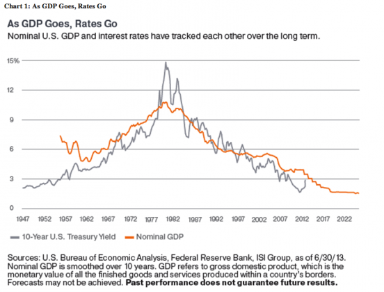
Worried About Rates? Worry About Growth.
Don’t worry about rising rates if you’re also worried about low growth….
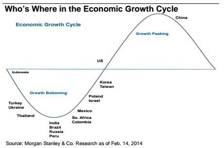
Who’s Where in the Economic Growth Cycle?
Here’s a nice bit of global macro perspective on the state of different economies in the business cycle. Clearly, this is an approximation, but I have a feeling they’re pretty close to right here: