Someone asked me in last week’s Q&A if I use technical analysis in my work. I said:
“Depends on what you mean specifically. Some forms of technical analysis, such as historical data, can be extremely helpful in understanding the probabilities of certain events and how the future rhymes with the past. Charting, a form of TA, is little more than a visual of this data and the fundamentals driving past prices. Charting is excellent for perspective, but is only a compliment to fundamentals in my opinion. I don’t put much weight in “bear flags” and “inverted hammers” and stuff like that. There’s a lot of datamining in those “indicators”. I use TA and historical data quite a bit in my work, but that’s more an effort to understand how the past is prologue.
My investment approach uses a big top down approach. So I start with an understanding of the monetary system, break this down to an understanding of its impact on specific markets, and filter that into a specific strategic approach. That’s all driven much more by fundamental work than anything else, but I do certainly utilize elements of charting and TA in my work….”
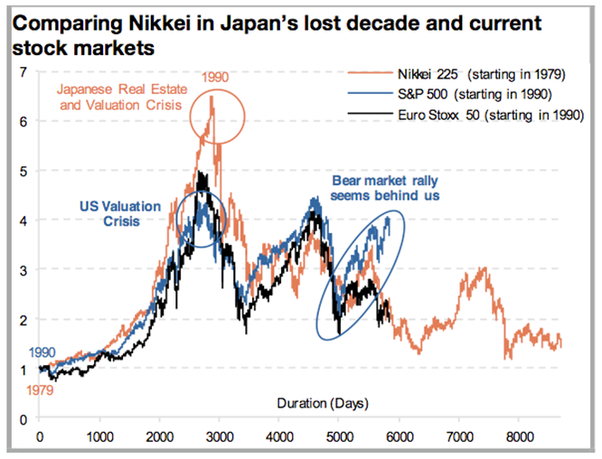
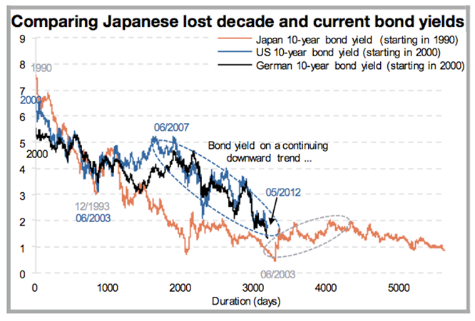
Here’s a good example of how technical analysis (charting to be more specific) can offer some of this perspective. The follow is via Todd Harrison at Minyanville:
“I’ve highlighted two graphics below, courtesy of Albert Edwards of Societe General. They paint an unpopular perspective but one we would be wise to consider. Markets move in two cycles—secular and cyclical—and while we’ve witnessed a Pulp Fiction-esque economic adrenaline-induced rally off the 2009 lows, the structural impediments to legitimate growth—in short, too much debt—remain in place.”

(US and European Equities vs Japanese Lost Decade)

(US and German Bond yields vs Japanese Lost Decade)
History doesn’t repeat, but it does rhyme. Understanding the big macro trends can really help gauge perspective in the markets and economy. Throw in some fundamental analysis on top of this and understand how a balance sheet recession works and suddenly these charts start to make perfect sense. And in this case, it looks like the whole world is starting to look Japanese….
Mr. Roche is the Founder and Chief Investment Officer of Discipline Funds.Discipline Funds is a low fee financial advisory firm with a focus on helping people be more disciplined with their finances.
He is also the author of Pragmatic Capitalism: What Every Investor Needs to Understand About Money and Finance, Understanding the Modern Monetary System and Understanding Modern Portfolio Construction.

Comments are closed.