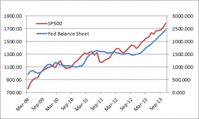
Sorry for the belligerent post title, but I really hate the chart below. You know it. You’ve seen it all over the place for 5 years straight. Heck, I’ve probably used it sometimes. But I hate it. Because I think it’s highly misleading.
The chart, which shows the size of the Fed’s balance sheet relative to the S&P 500, is usually presented to imply some sort of direct causal relationship between QE and stock price movements. I don’t deny that the portfolio rebalancing channel probably has some indirect impact on asset prices. In fact, I think it could be pretty powerful. But I don’t think this chart is all that helpful in gauging where the S&P 500 is headed or why it might go in a particular direction. And more importantly, I think there have been much more important factors driving the stock market over the last 5 years than QE.
(Stupid QE Chart Numero Uno)
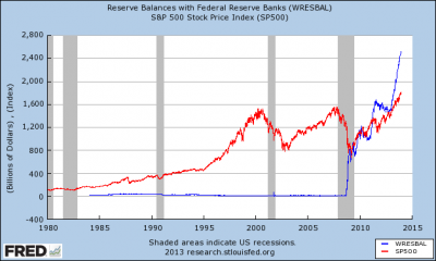
First, let’s put the above chart in the right context. If we take the long view then the scale of the chart starts to look a little suspicious as seen below:
(Stupid QE Chart Numero Dos)
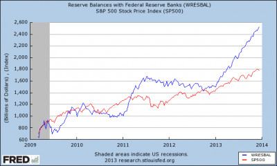
Okay, but what if we just use figure one? That’s better, right? After all, there was no QE before 2008 so it’s no fair to use the long-term chart. This is a lot better, but it still shows a huge discrepancy there between the S&P 500 and QE in the last few years. After all, the Fed’s balance sheet has grown by about 30% per year while the S&P 500 has grown about 20% per year over this period. But we can do better than this. So, what we usually see is something like this:
(Stupid QE Chart Numero Tres)
Yes, if you just rearrange the axis a little bit you can actually make QE look like it’s driving the stock market perfectly. Of course, if you continued to let figure 1 run in the coming years (assuming 30% growth in the Fed’s balance sheet) then there’s a high probability that this chart would start to look increasingly silly over time. So what we really have here is a fantastic case of data mining and recency bias where people are infatuated with QE and recent market returns and making the data fit their conclusions in any way possible.
Bottom line, don’t use figure 3 or anything like figure 3. It’s a little lazy if you ask me. There’s a lot more to QE than a clever sounding conspiracy theory about how the Fed is driving stocks higher in some directly correlated balance sheet maneuver.
Related:
Mr. Roche is the Founder and Chief Investment Officer of Discipline Funds.Discipline Funds is a low fee financial advisory firm with a focus on helping people be more disciplined with their finances.
He is also the author of Pragmatic Capitalism: What Every Investor Needs to Understand About Money and Finance, Understanding the Modern Monetary System and Understanding Modern Portfolio Construction.


Comments are closed.