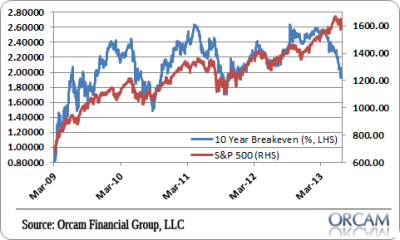
It’s been pretty interesting to see the S&P 500 hold up rather well against a backdrop of plummeting inflation expectations. According to the 10 year break-even inflation expectations are the lowest they’ve been since the last outbreak of the Euro crisis in the summer of 2011.
What’s even more interesting to me though, is how much nominal 10 year bond yields have actually risen. The last few times we saw inflation expectations collapse it was mainly due to the 10 year falling more relative to TIPS. In this case, TIPS have actually risen more than 10 year yields. In each of the last few cases the market ended up being right about the low inflation trend, but this bond sell-off has a bit of a different flavor to it.
We all know that the government’s data is under extraordinary scrutiny and skepticism at all times. That’s understandable given the amount of tinkering and tweaking that goes into a data set like the Consumer Price Index. But what about the independent inflation gauges? What are they saying? Is it really different this time? Is the stock market getting this one right? In order to gauge the current environment and how valid the market’s views are, it is helpful to look at data outside of the government’s own inflation readings.
(Break-even Inflation Expectations vs SP 500)
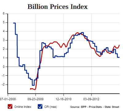
The most prominent independent inflation gauge is the Billion Prices Index from MIT. It’s beginning to show an interesting divergence from the CPI in recent months. As the CPI sinks, the BPP rises to above 2.5%. That’s still very low inflation, but the divergence is notable.
(Figure 1 – Billion Price Project US Inflation Index)
The ECRI’s Future Inflation Gauge is also showing low inflation by historical standards. The latest reading of 103.9 is virtually flat compared to readings in recent years which is consistent with a very low rate of inflation.
(Figure 2 – ECRI Future Inflation Gauge)
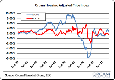
The Orcam Housing Adjusted Price Index treats housing as both investment as well as consumption and includes the rate of change in house prices in the CPI as opposed to the BLS measure of Owners Equivalent Rent. This index has shown much higher rates of inflation during bubbly economic periods like the housing boom, which I believe might have helped give the Fed greater insight into the environment and provide an alternative perspective to the common idea that inflation was low during the bubble. It was anything but low when you look at the consumers most important balance sheet item (housing).
This index is also diverging from the CPI. The latest reading of 3.29% is still low by historical standards, but certainly higher than the CPI. Chart via Orcam Investment Research:
(Figure 3 – Orcam Housing Adjusted Price Index)
It’s interesting to see the various independent gauges and how they compare to actual market action. It would appear that two of our independent gauges confirm the benign stock sell-off and higher inflation fears.
Mr. Roche is the Founder and Chief Investment Officer of Discipline Funds.Discipline Funds is a low fee financial advisory firm with a focus on helping people be more disciplined with their finances.
He is also the author of Pragmatic Capitalism: What Every Investor Needs to Understand About Money and Finance, Understanding the Modern Monetary System and Understanding Modern Portfolio Construction.


Comments are closed.