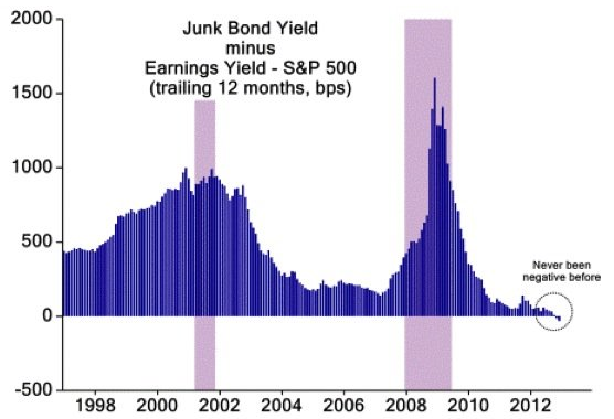
Here’s another good chart from the BI list that I posted earlier. This one comes from David Schawel. It shows the junk bond yield minus the earnings yield on the S&P 500. As you can see, the spread is at a level that almost defies logic. This is a theme that’s been growing in popularity in recent months (see here for instance).
Here’s David’ comment:
“The chart below shows the spread between the yield on junk bonds and the yield received from holding stocks. The spread recently turned negative for the first time ever, showing just how much the yields on high-risk bonds have come down as central banks keep benchmark borrowing rates depressed and investors search further out on the risk spectrum for yield.”
Mr. Roche is the Founder and Chief Investment Officer of Discipline Funds.Discipline Funds is a low fee financial advisory firm with a focus on helping people be more disciplined with their finances.
He is also the author of Pragmatic Capitalism: What Every Investor Needs to Understand About Money and Finance, Understanding the Modern Monetary System and Understanding Modern Portfolio Construction.


Comments are closed.