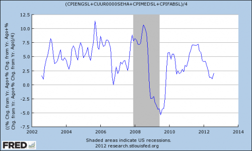
One of the common responses to my recent post on inflation (and its low levels) is that inflation in the things that matter most is well above where the overall index is. This is a fair critique. The BLS lets us break-down the data into segments so we can actually create a fairly good inflation reading for particular items.
In the index below, I’ve taken medical, food, beverages, rent and energy indices. The goal is to focus most on those indices that hurt an average middle class family the most. These are the things they can’t live without. So we’ve eliminated many of the things that might bring the index down and skew it towards the appearance looking lower than prices actually feel.
What’s it say? It tells a slightly different story than the headline index. But it’s still below the historical average of 3.5%. And the most interesting part is that this index has surged over the last 10 years. You can see that the averaged reading over the last 10 years has been well above the long-term inflation average of 3.5%. Perhaps that explains why many people feel this disconnect between the government data and their actual costs. The latest reading of about 2% is still historically low though. But with gas prices now surging again we might be feeling more inflation pain for the middle class….
Mr. Roche is the Founder and Chief Investment Officer of Discipline Funds.Discipline Funds is a low fee financial advisory firm with a focus on helping people be more disciplined with their finances.
He is also the author of Pragmatic Capitalism: What Every Investor Needs to Understand About Money and Finance, Understanding the Modern Monetary System and Understanding Modern Portfolio Construction.


Comments are closed.