I jumped off the Apple bandwagon about a year ago when I bought my first Android (which was admittedly just an adequate phone) and started to get the impression that what was once an uncommon product (the iPhone) was now becoming a common one.
There was a time when the iPhone was unmatched. That’s not to say that it’s a bad product these days. It’s certainly not. But the competition has more than closed the gap. I’ve since purchased a Samsung Galaxy S3 (though I still use an iPad and iPod) and I can’t imagine ever switching back. Especially since my digital life is now synced through a Google account.
Luckily for Apple shareholders, the company isn’t a one trick pony. After all, it’s not like we’re starting at Blackberry here.
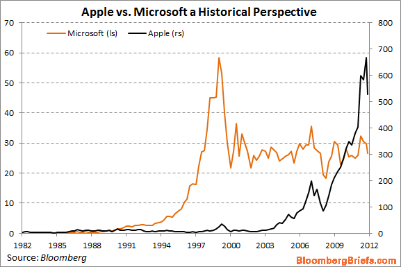
But I did find this corollary interesting – Apple versus Microsoft stock performance. I hate to extrapolate out using such biased data, but the chart is thought provoking if nothing else. I’ll let the readers form their own conclusions on this one, but I thought this chart via Bloomberg Briefs was pretty interesting:
Mr. Roche is the Founder and Chief Investment Officer of Discipline Funds.Discipline Funds is a low fee financial advisory firm with a focus on helping people be more disciplined with their finances.
He is also the author of Pragmatic Capitalism: What Every Investor Needs to Understand About Money and Finance, Understanding the Modern Monetary System and Understanding Modern Portfolio Construction.


Comments are closed.