
A big fuss has been made in recent days about the analog chart comparing the current market rally to the 1929 rally (I posted a brief snippet here which did not come close to detailing why I am not a big fan of the chart). Many of these pieces are based on a misunderstanding that I think is worth clarifying. First of all, the 1929 chart looks frightening because 1929 was obviously a horrible market environment in which the Dow fell by over 40% in about a month. The biggest criticism of the chart is that it can be interpreted to imply that we’re on the verge of a similar market decline. There are a lot of problems with implying such a thing, but we also have to be careful about jumping to conclusions here because the details surrounding this chart are important and potentially useful.
This chart first appeared late last year when Tom McClellan posted it to his site. I post Tom’s material here at Pragcap on occasion and find it to be of consistently high quality. I didn’t post that original piece because I thought some people might misinterpret the 1929 chart and believe that it was fear mongering. That’s exactly what happened. And after a bit of controversy followed the original post Tom posted a follow-up which explained the chart in more detail. It was a very useful explanation that cleared up much of the confusion. But the confusion has continued today primarily because some other people have picked up on the chart and used it to imply that we could be on the verge of that 40%+ crash. The thing is, Tom never implied this. He was simply pointing out that the market pattern was similar. In other words, the chart below very clearly shows that the potential downside risk to the Dow is about the 14,000 level. Therefore, the downside risk according to Tom’s analysis is 12.5%. NOT 40%+.
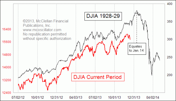
Anyhow, I personally don’t think this environment resembles 1929 in many ways. But I work from a more fundamental perspective whereas Tom is an expert in technical analysis. In addition, I can see how some people might misinterpret the chart and use it with a more malicious intent than Tom intended. But it should be noted that this was not the original intent of the chart and Tom was simply pointing out that the market action rhymes, but not that it meant there was 40%+ downside risk. Whether a past technical trend translates into actionable market analysis is obviously something that is highly debatable. But that’s a different matter. Anyhow, I hope that clarifies some of the confusion here.
Mr. Roche is the Founder and Chief Investment Officer of Discipline Funds.Discipline Funds is a low fee financial advisory firm with a focus on helping people be more disciplined with their finances.
He is also the author of Pragmatic Capitalism: What Every Investor Needs to Understand About Money and Finance, Understanding the Modern Monetary System and Understanding Modern Portfolio Construction.
Comments are closed.