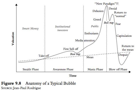
“There is no standard definition of a bubble, but all bubbles look alike because they all go through similar phases. The bible on bubbles is Manias, Panics and Crashes, by Charles Kindleberger. In the book, Kindleberger outlined the five phases of a bubble. He borrowed heavily from the work of the great economist Hyman Minsky. If you look at Figures 9.7 and 9.8 (below), you can see the classic bubble pattern.”
Category: Chart Of The Day
(Just Charts)
Rail Traffic Continues Modest Expansion
Just chugging along here. Intermodal was up 3.2% on the week bringing the 12 week moving average to 4.2%. That’s the highest 12 week average in 6 months. If the [ … ]
Rail Traffic Growth Hits New 6 Month Highs
While there are some minor signs of broader economic slowing, it’s certainly not showing up in rail traffic data. This week’s traffic trends showed a continued improvement off the June [ … ]
Improving Euro Zone Macroeconomic Expectations Point to Earnings Recovery
Good chart and insight here from Guggenheim: The ZEW euro zone macroeconomic expectation index rose to a 4-year high of 59.1 in October, indicating a majority of financial analysts and [ … ]
Rail Traffic Continues to Point Towards Economic Growth
No big change in rail trends this week as the growth continues. The year over year growth in intermodal came to 4% in the latest reading from AAR. This brings [ … ]
On the Bright Side…Gas Prices are Way Down
Our government might not work any more, but one thing I’ve noticed over the last few years is how steady gas prices have been. I live in a part of [ … ]
Chart O’ The Day: U.S. Government Credit Default Swaps Moving on up
If you’ve read my primer on the monetary system you know that the USA isn’t really bankrupt. And you know it can’t technically go bankrupt. That is, the US government [ … ]
Global Inflation – Still Not an Issue
The global inflation picture hasn’t changed much in recent months. As the global economy grows sluggishly inflation rates seem to be flatlining. In fact, in many of the largest economies [ … ]
3 For 33
Since 1980 the Barclays US Aggregate Bond Index has only recorded an annual loss twice. For more than 30 years investors have benefited from a secular decline in interest rates (and associated rise in bond prices).

