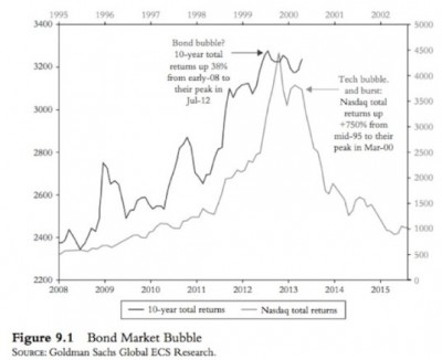
Here’s a lesson in the dangers of charting. The following quote is from John Mauldin’s latest weekly letter. He’s making the case for a bond bubble. This chart specifically refers to US government 10 years:
One day, all the debt will come due, and it will end with a bang. “We are building a bigger time bomb” with $500 billion a year in debt coming due between 2018 and 2020, at a point in time when the bonds might not be able to be refinanced as easily as they are today, Mr. Ross said. Government bonds are not even safe because if they revert to the average yield seen between 2000 and 2010, ten year treasuries would be down 23 percent. “If there is so much downside risk in normal treasuries,” riskier high yield is even more mispriced, Mr. Ross said. “We may look back and say the real bubble is debt.”
I have a couple of thoughts here:
1) The debt actually doesn’t all “come due”. In a credit based monetary system it’s actually impossible for ALL of the debt to come due because that would actually eliminate most of the money we use. Repaying loans destroys deposits just like new loans create deposits. But think of this specifically from the government’s perspective. The only way the debt goes away is if the government goes away or is reduced SUBSTANTIALLY. But the reason the government’s debt continually expands is because the services never go away. The government tends to grow in-line with the economy and the population as the needs of the public grow. That doesn’t mean the government can’t shrink or that debt can’t be reduced, but it’s virtually impossible for it to all “come due”. I’m not against shrinking the size of government at all, but I think the terminology here is a little misleading.
2) More importantly, the chart is a case of manipulating the axis on one side to make the other lines appear similar. If you look closely you’ll see that the Nasdaq expanded over 400% over this period while the bonds are up just 33%. Using this sort of analysis could lead one to justify the idea of a “bubble” using almost any level of price rise at all. That’s obviously not very useful and in this case a 33% rise and a 400% rise are obviously apples and oranges.
I’ve been debunking the US government “bond bubble” story for over 4 years now so you’ve probably read some version of this over the years. But this doesn’t mean bonds aren’t potentially overpriced. Especially junk bonds and some other corporate bonds that have benefited from the chase for yield induced by the Fed. But I think we have to be careful about the term “bubble”, especially when discussing government bonds. “Bubble” implies an extraordinarily overpriced market susceptible to tremendous downside. Frankly, I don’t think Treasury Bonds look remotely similar to something like the Nasdaq….
Mr. Roche is the Founder and Chief Investment Officer of Discipline Funds.Discipline Funds is a low fee financial advisory firm with a focus on helping people be more disciplined with their finances.
He is also the author of Pragmatic Capitalism: What Every Investor Needs to Understand About Money and Finance, Understanding the Modern Monetary System and Understanding Modern Portfolio Construction.


Comments are closed.