Mark Gongloff has a good piece in the Huffington Post on households and debt. He says household debt is still too high. But he looks at nominal debt levels without comparing them to anything else. I think you have to put this in the right perspective because high debt levels are not inherently problematic. High debt levels are problematic when the incomes don’t exist to service those debts. So we have to compare debt relative to other components.
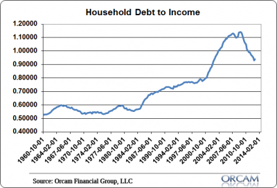
The primary chart I’ve used over the years to portray the household debt burden was household debt to personal income. You can see how distorted this got during the run-up to the housing boom. But it’s also made huge improvement in recent years:
So, is the debt still too high? We could probably benefit from some more downside in this chart, but given the roaring housing market I wouldn’t be one bit surprised to see that little uptick turn into an uptrend in the coming quarters. The de-leveraging cycle in the USA is essentially over and while households still aren’t borrowing a lot, they’re really not de-leveraging much either.
Mr. Roche is the Founder and Chief Investment Officer of Discipline Funds.Discipline Funds is a low fee financial advisory firm with a focus on helping people be more disciplined with their finances.
He is also the author of Pragmatic Capitalism: What Every Investor Needs to Understand About Money and Finance, Understanding the Modern Monetary System and Understanding Modern Portfolio Construction.


Comments are closed.