
Just some brief thoughts here following the release of yesterday’s Z.1 Flow of Funds:
The sector financial balances chart shows us the relationship between the three sectors of the economy – foreign and domestic with domestic broken down by private and public. As I’ve discussed in some detail in the past the deficit has fallen in the USA primarily because the private sector is healing and tax receipts are increasing. You have to dig past the three sector model here to understand the drivers at work here. Otherwise one might conclude that a declining deficit is always bad.
I should add that there has been some minor degree of austerity as the government could have done much more to support the private sector in recent years via tax cuts or spending increases. The current picture is largely reflective of better times, but as times get better we also have to be mindful of the reality that stability tends to breed instability as the cycle advances. Given the unusual weakness of the economy I think this sort of thinking is particularly pertinent in this cycle.

The private sector’s net worth is at an all-time high. This is largely the result of substantial gains in assets like real estate and stock holdings.

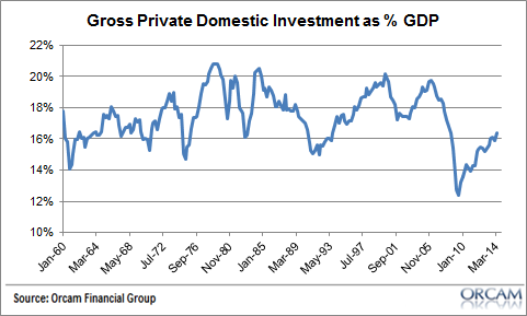
Gross private domestic investment remains somewhat weak, but continues to come back from its worst decline in the last 50 years.
Household and nonprofit equity holdings as a percentage of net worth continue to climb, but are not as high as they were in some past equity market bubbles like the period preceding the Nasdaq bubble. This means that households are levered to stocks, but not as levered as they have been in the past.

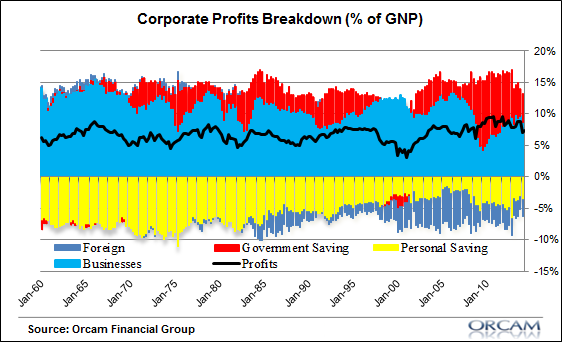
Corporate profits have been increasingly driven by trends in the corporate sector including dividends and private investment. The government has played a substantial role in the corporate profits picture in the last 5 years, but the government effect has waned over time as the private sector has healed and slowly picked up the pace.
There’s nothing earth shattering from this report, but it does support the muddle through perspective I’ve maintained for the last few years. We’re crawling out of a very deep hole, but still headed in the right direction, albeit very slowly.
Mr. Roche is the Founder and Chief Investment Officer of Discipline Funds.Discipline Funds is a low fee financial advisory firm with a focus on helping people be more disciplined with their finances.
He is also the author of Pragmatic Capitalism: What Every Investor Needs to Understand About Money and Finance, Understanding the Modern Monetary System and Understanding Modern Portfolio Construction.
Geoff
These charts certainly show a more positive picture than the ones you posted the other day, which were based on median.
https://pragcap.com/why-it-still-doesnt-feel-like-a-recovery-for-most-people
Cullen Roche
Well, I should add that the recovery has been particularly uneven. That is, those who own assets have benefited to a larger degree in large part because the Fed’s policies have centered around bolstering asset prices.
tealeaves
Yellen’s speech yesterday indicated she wanted the lower and median class to increase their financial assets and diversify from home equity so to prepare for a future crisis. Building assets for a rainy day is certainly prudent but I worry this may lead to something interesting in the stock market like it did for housing.
https://www.federalreserve.gov/newsevents/speech/yellen20140918a.htm
That said, proprieter’s equity as a % of networth has been steadily decreased since the 60s. Is this an indication of less entrepreneurial risking taking by individuals with fewer private small business being created. Or simply the result of business incorporating? To me I think that area seems a better area for the Fed to promote in term of building private “assets” rather then risking speculation in financial assets.
https://research.stlouisfed.org/fred2/graph/?g=KQD
videonation
The private sector net worth number may be correct. But the distribution is the rub.
Poseidon's Bear
Muddle through indeed. That’s what happens when the economy is dominated by a financial cycle rather than business cycles.
Our stick rate won’t turn green until the HH sector debt levels fall substantially.
Andrea
These graphs show mainly the “assets” side of the economy — the question is what is happening to the liabilities side as well (hint: not as promising).
Either way, with personal savings not at a historical low, but not stellar either, much of the individual net worth is now “paper wealth”.
The sustainability of the muddle through scenario much depends on the sustainability of the liabilities scenario given so much paper collateral and dependency on ultra-low interest rates.
Dennis Kleid
I wish I understood better about this Michał Kalecki chart and the underlying data. Is red “deficit spending” when on top, and government surplus when at the bottom. Is yellow all “private savings” not just personal savings, and what is considered savings (does that include holding stock certificates)? Is the purple US folks investing in foreign assets? Finally, blue, what is that? Is that credit generated and spent on business and homes? I need help….
Dennis Kleid
The question asked about the economy is always: Is the economy on the right track or the wrong track? I would check the “muddle on slow track” box if only I were given that choice.
blonderealist
Muddle through like Japan, only faster — but still much slower than most would have guessed. I continue to believe this will be the longest “muddle through” for the U.S. in decades.