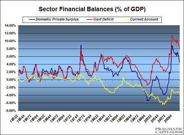
I am a little late to the party here following the Fed’s Z1 release, but here’s an update on the current state of the sector balances in the USA. For the unitiated I would highly recommend reading the section in my monetary primer on the sectoral balance and proceed to the S=I+(S-I) discussion to round that out, but here’s a brief overview:
“The Sectoral Financial Balance approach measures the income of the three sectors net of spending over a given time period. When any sector spends more than its income it runs a deficit and, vice versa, when a sector spends less than its income it runs surplus. It is vital to recognize that amongst the three main sectors it is the public sector (and the federal government in particular) that is most able to run large deficits over a prolonged period. This is because the budget constraint of the US federal government is not similar to that of an individual, household, business or even a state or local government.
The deficit of the entire government (federal, state, and local) is always equal (by definition) to the current account deficit plus the private sector balance (excess of private saving over investment). To be more precise: net household financial income = current account surplus + government deficit + Δbusiness non-financial assets. The private sector surplus represents the net saving of the private sector (households and businesses) from income after spending, while the public sector deficit is the government’s deficit. This is the essence of the sectoral balances approach made famous by the late great Wynne Godley.”
So the current state is as follows. The private sector is slowly starting to re-leverage, however, this is a fragile trend at best that could easily be reset if austerity sets in. When the credit bubble imploded following the housing bubble spenders turned into savers in order to pare back debt and repair busted balance sheets. The foreign sector in the USA is a demand leakage since we run a current account deficit. But the saving grace during the last 5 years was the massive government budget deficit via a combination of more spending and lower taxes. This income allowed the private sector to de-leverage without causing a depression. The exact opposite has occurred in much of Europe where de-leveraging has occurred during a time of government austerity. For the current account deficit nations this has resulted in full-blown depression.
Anyhow, the current state of affairs – the current account has remained right near the 3.5% of GDP range. But the government’s deficit has remained sizable though shrinking some in recent quarters. That blue line is the domestic private surplus. At about 5% this is still a healthy figure and a big part of why the US economy is holding up better than many other nations during this de-leveraging cycle.

Mr. Roche is the Founder and Chief Investment Officer of Discipline Funds.Discipline Funds is a low fee financial advisory firm with a focus on helping people be more disciplined with their finances.
He is also the author of Pragmatic Capitalism: What Every Investor Needs to Understand About Money and Finance, Understanding the Modern Monetary System and Understanding Modern Portfolio Construction.

Comments are closed.