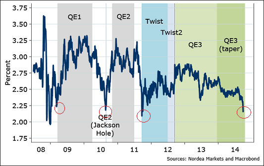
Here’s another perspective of the chart I posted the other day showing break-evens, the difference between bonds and TIPS. This one is from Martin Enlund and Nordea Markets. It shows the 5 year break-evens along with the Fed’s initiation of different QE programs. As you can see, this isn’t exactly the type of environment that has been consistent with the Fed’s desire to tighten. If anything, the Fed is probably wishing they had more ammo….
Mr. Roche is the Founder and Chief Investment Officer of Discipline Funds.Discipline Funds is a low fee financial advisory firm with a focus on helping people be more disciplined with their finances.
He is also the author of Pragmatic Capitalism: What Every Investor Needs to Understand About Money and Finance, Understanding the Modern Monetary System and Understanding Modern Portfolio Construction.

