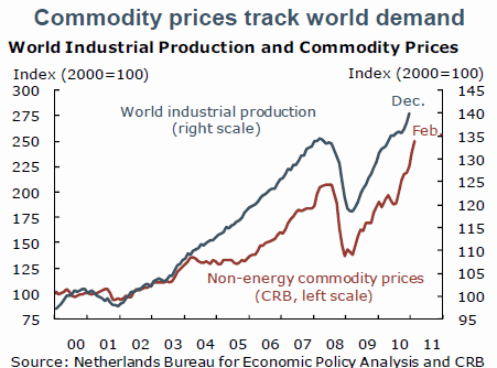
There’s this chart going around courtesy of the San Francisco Fed that supposedly shows how commodity prices are not being at all influenced by Fed policy and speculators. In short, it shows a near perfect correlation between world industrial production and commodity prices.

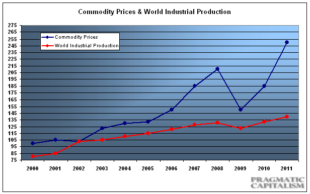
At first glance you might think: “gee, this really is entirely fundamentally driven and the Fed is having zero impact on everything”. But when one looks at the chart closely you notice that the scales are entirely manipulated to give the appearance of a close correlation. When one backs out the scaled manipulation you get something that looks like this:

All of the sudden it looks like commodities and world industrial production have little to no correlation. What’s the conclusion? Don’t believe everything you see – especially when it comes from an outfit whose job it is to protect Fed policy at any cost.
Of course, this doesn’t mean that all of the conclusions based on the original chart are wrong. Indeed, demand really is having an important impact on prices. And the arguments about the Fed “money printing” not leading to commodity inflation are all true – as I’ve shown in detail the Fed isn’t really flooding the economy with money. More importantly, the arguments backing the China + “money printing” + growth = commodity boom, are likely all close to spot on. But to trot out this chart as a defense for the Fed and conclude that speculation is playing no role in the current run-up in commodities is sheer nonsense. Especially when we have visual proof that speculators are hoarding commodities due to their belief in future higher prices….The Fed is intentionally manipulating investor expectations of inflation and it is working. Whether it is having a positive or negative impact on the economy is the real meat of the debate and that’s for another discussion.
Update – I don’t think I got my point across entirely. It’s clear from the data that the Fed is merely fitting their data to a conclusion as opposed to looking at the data for what it actually is. In fact, if you back this data up you’ll notice that this is quite a nasty little case of datamining by the Fed. From the period of 1970-2004 industrial production increased over 100% while the CRB index went nowhere. The recent correlation (since the 200’s) actually makes a case against the Fed and their interventionist policy….
Mr. Roche is the Founder and Chief Investment Officer of Discipline Funds.Discipline Funds is a low fee financial advisory firm with a focus on helping people be more disciplined with their finances.
He is also the author of Pragmatic Capitalism: What Every Investor Needs to Understand About Money and Finance, Understanding the Modern Monetary System and Understanding Modern Portfolio Construction.

Comments are closed.